JEWEL
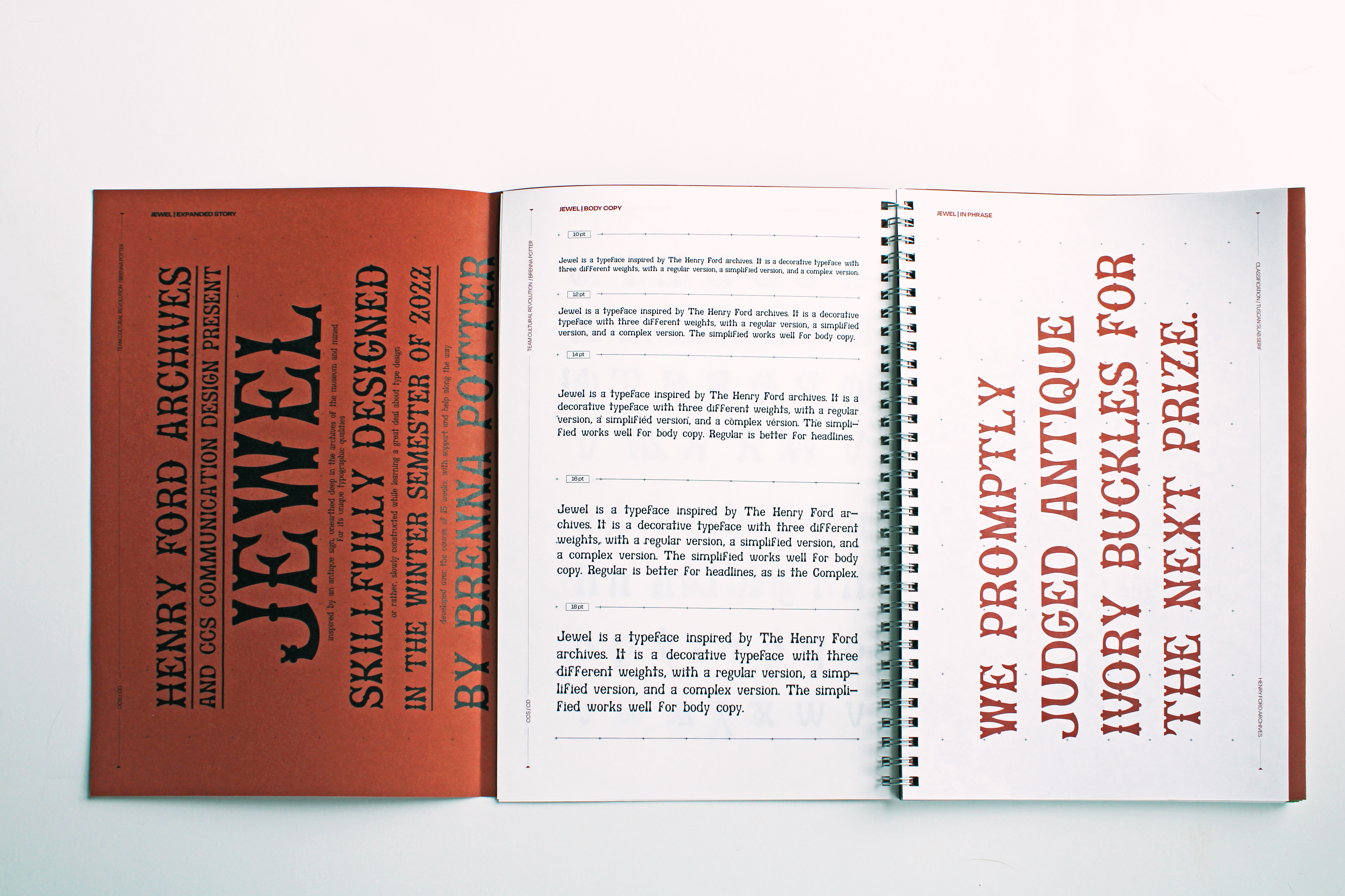
TYPE DESIGNJewel was developed as a collaborative project with The Henry Ford Museum: the project began with a tour of their archives, finding forgotten pieces of history. I chose an antique Jewellers sign, and built an entire typeface around it, with a simplified and complex version.
* 2023 Communication Arts Typography Annual Winner

CONTENT
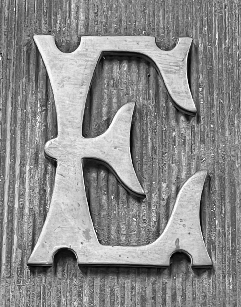
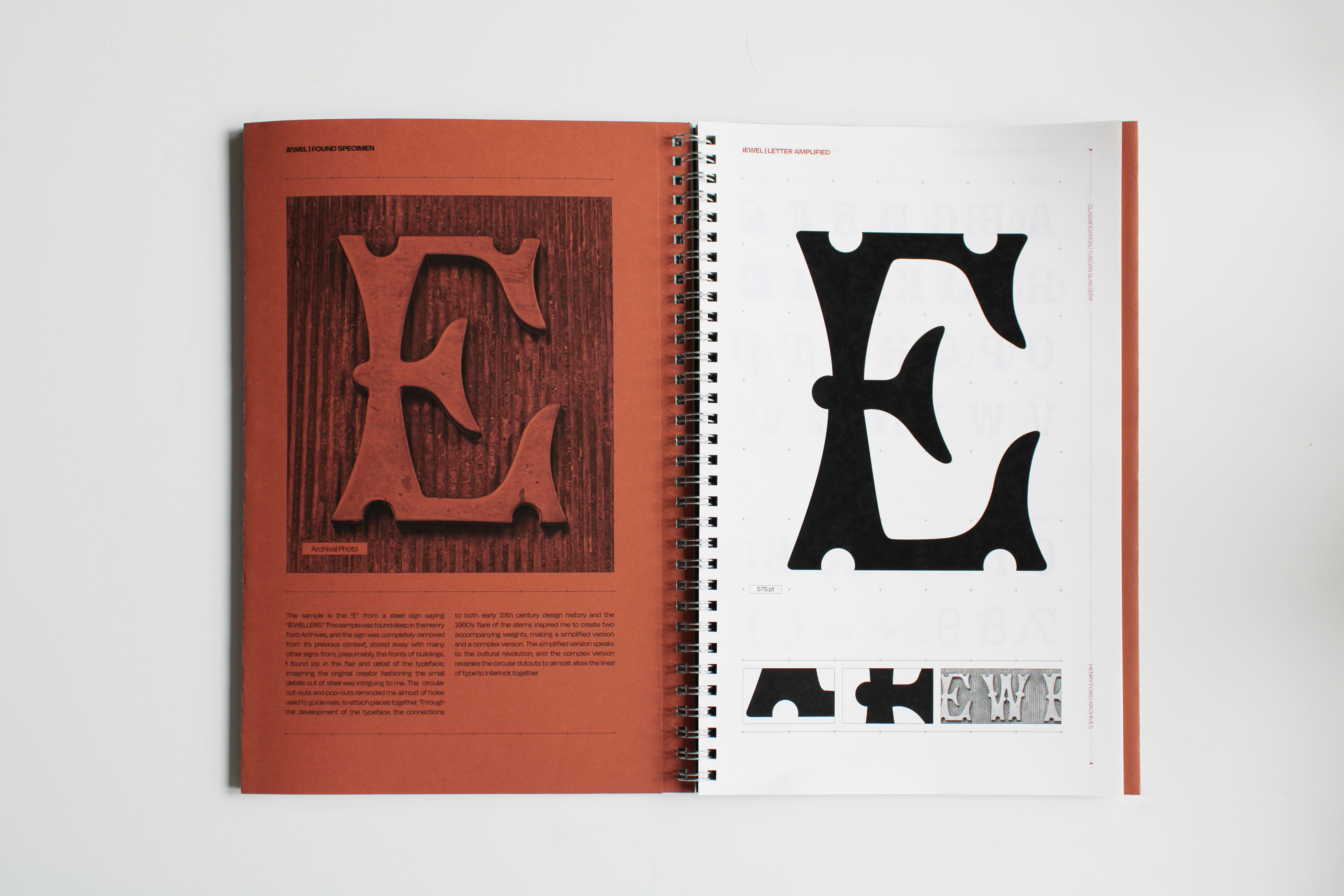
Jewel came from one letter: built around this E, using the proportions and design of this metal cut type, and breathing new life into it as a digital type sample. The E was found deep in the museum archives, amongst hundreds of beautiful type samples. I selected it as my focus for it’s wood type, tuscan charm.

PROCESS
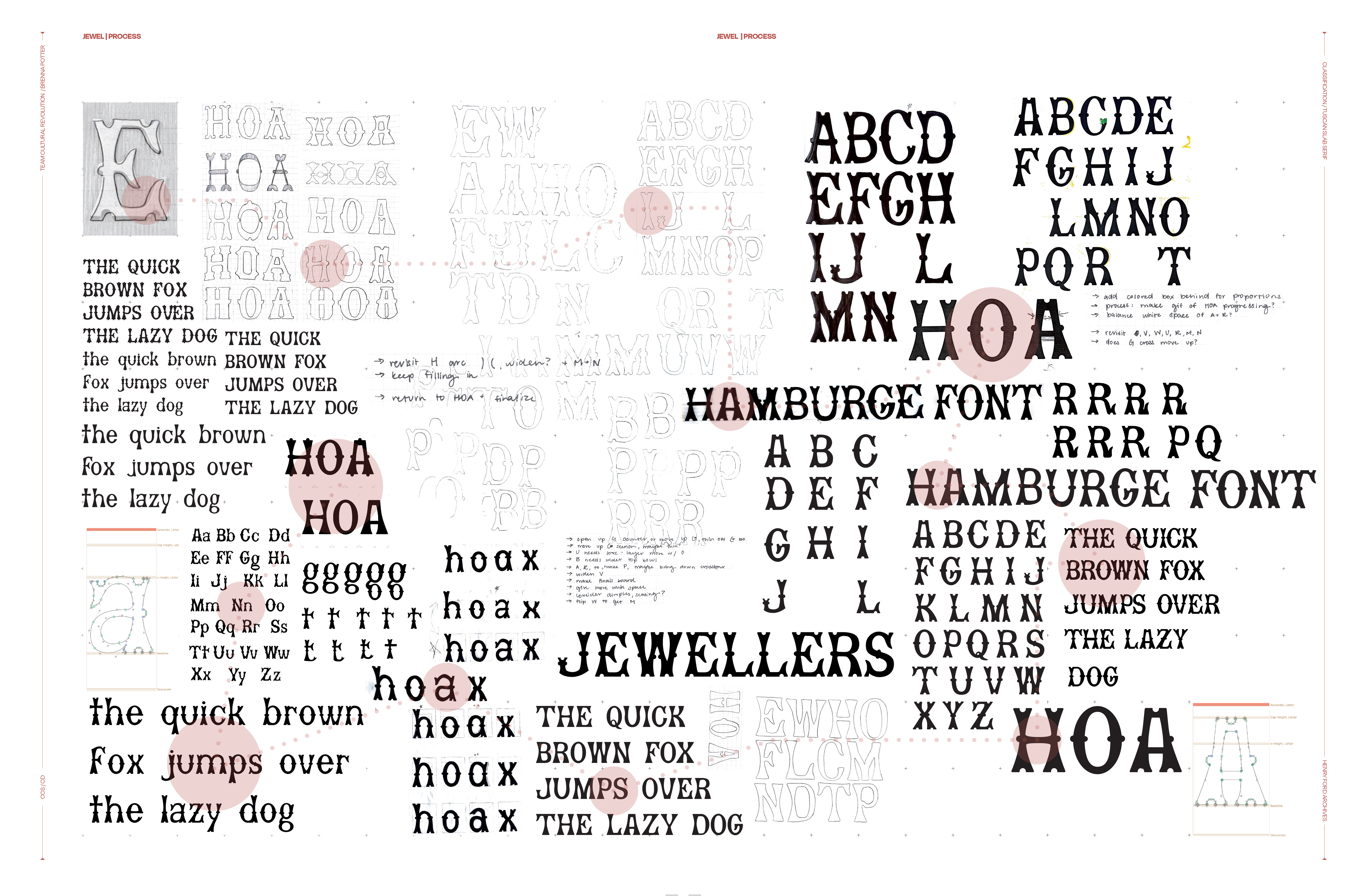
The process began with sketching out HOAs: determining the proportions and style of the type. From there, hundreds of pieces of tracing paper, hand designing each letter before moving digitally to further develop the letterforms. See some of the process below, with the progression of the HOA and a layered look at all my process!

CHALLENGES
This project was a new one to me, giving me a fully new perspective on type. Keeping everything proportional, matching, and balanced was difficult, and required reusing and reworking the same kit of parts. Q, K, and R are tricky letters: a lot to fit into one shape!


PROCESS︎︎︎
