CORITA KENT
PRINT DESIGNDesign does not occur in a vacuum; design exists as a product of culture. Corita Kent was known as the Pop Art Nun; one of few female designers remembered through time. She was influential in her graphic, vibrant, bold typography, and her teaching philosophy. This piece was designed to honor her legacy and her design, recognizing her as a fully rounded designer, rather than a nun or a teacher alone.
CONTENT
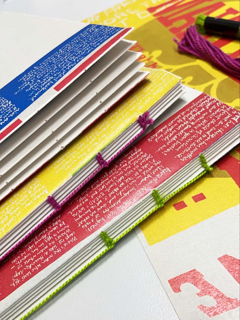
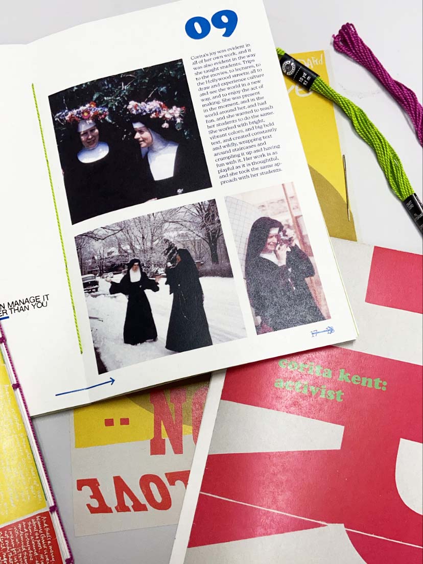
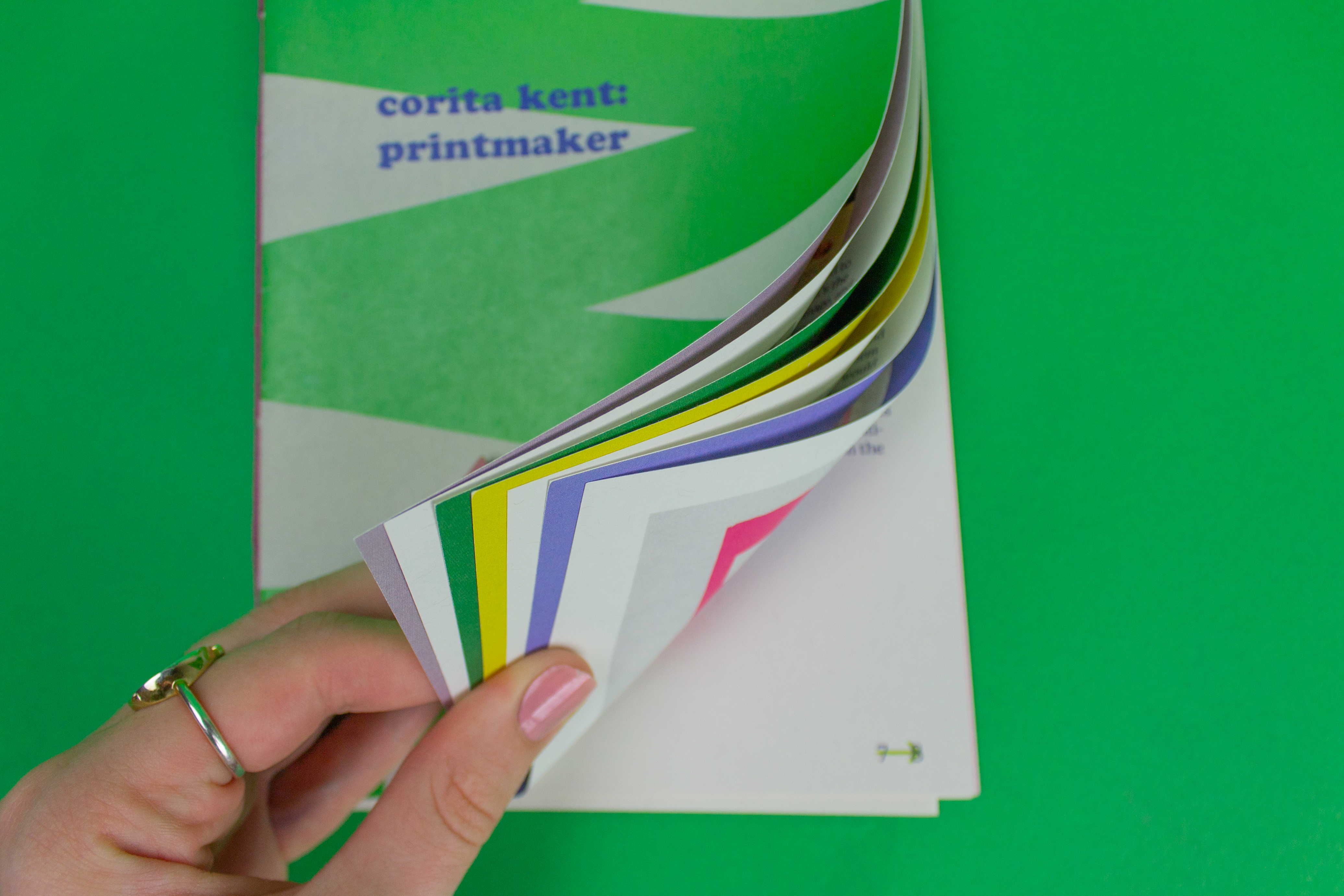
This piece is recognized as a set of three zines. The first zine presents a view of Corita as an educator, the second discusses her as a printmaker, and the third centers on her life as an activist. The format was specifically chosen to honor Corita, as the zine style honors her commitment to making her work accessible for everyone.PROCESS
The discovery of these three sides and more hidden parts of her personality led to the design choice of placing type within the page folds, so a user is invited to peel back the layers of her work and outer personality to inner conflicts. She did not relish the spotlight, preferring to stand behind her work, so the type set behind reflects her quiet nature.CHALLENGES
Due to the depth of research to understand her work in context, the biggest challenge was paring down all of that information into three zines. To still communicate the story, two different reads were created within one composition. This is reflected in the outer and inner type, and how they work together. The story is also built over three documents, each working on their own but combining to be an even stronger system.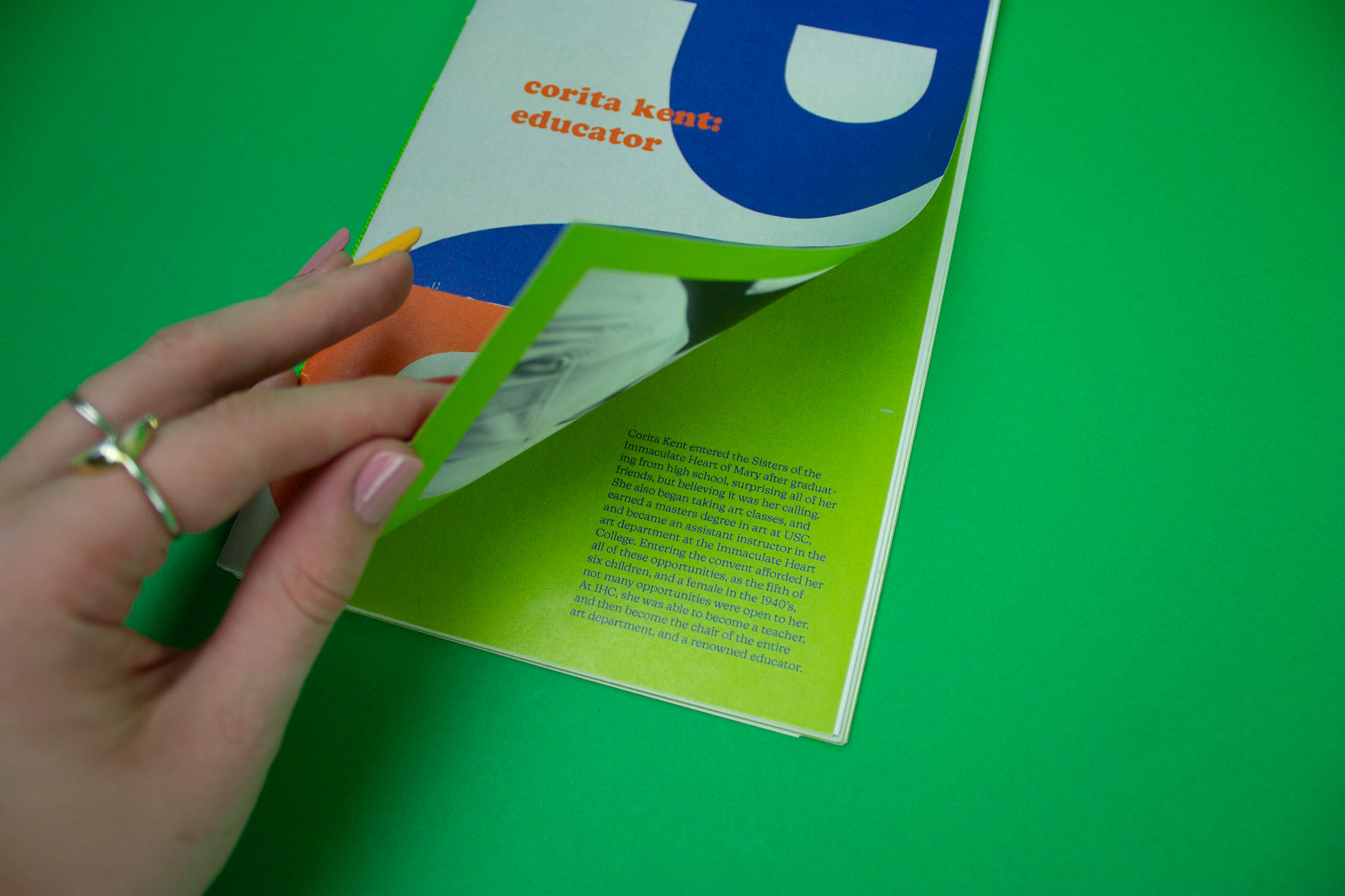


Process Images ︎︎︎